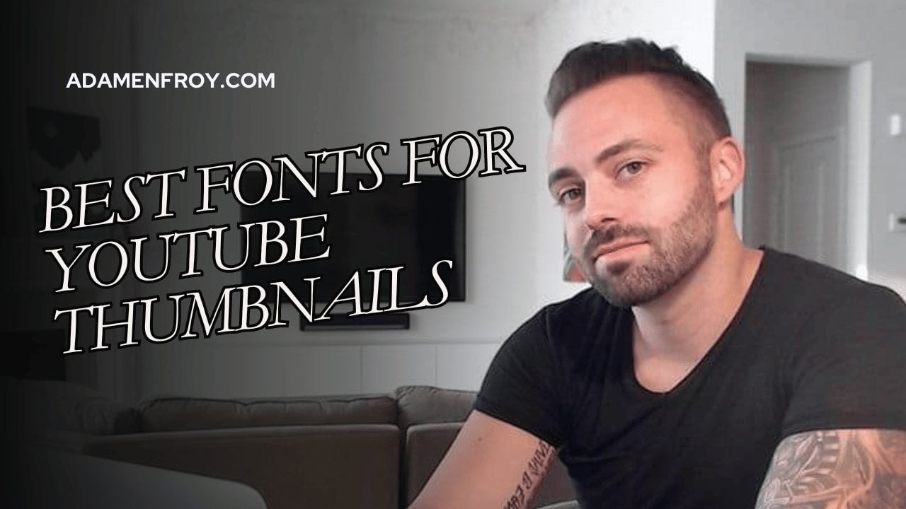

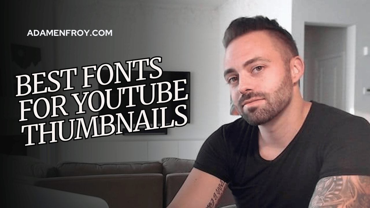


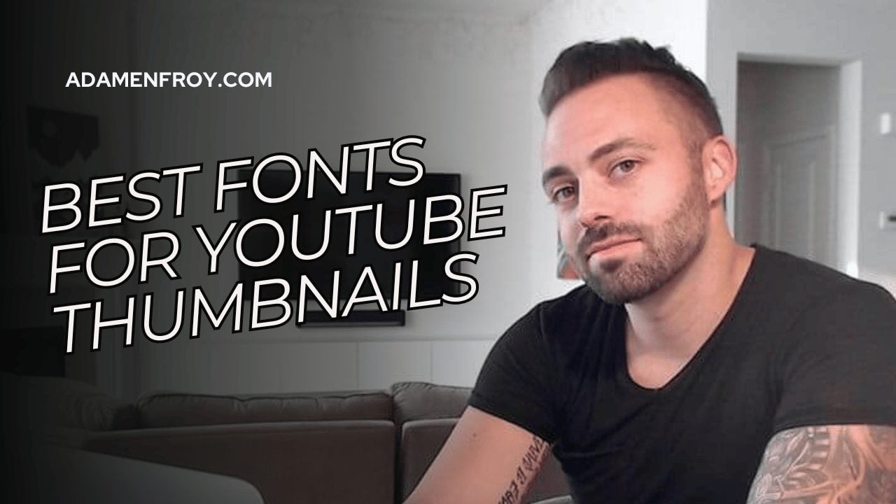


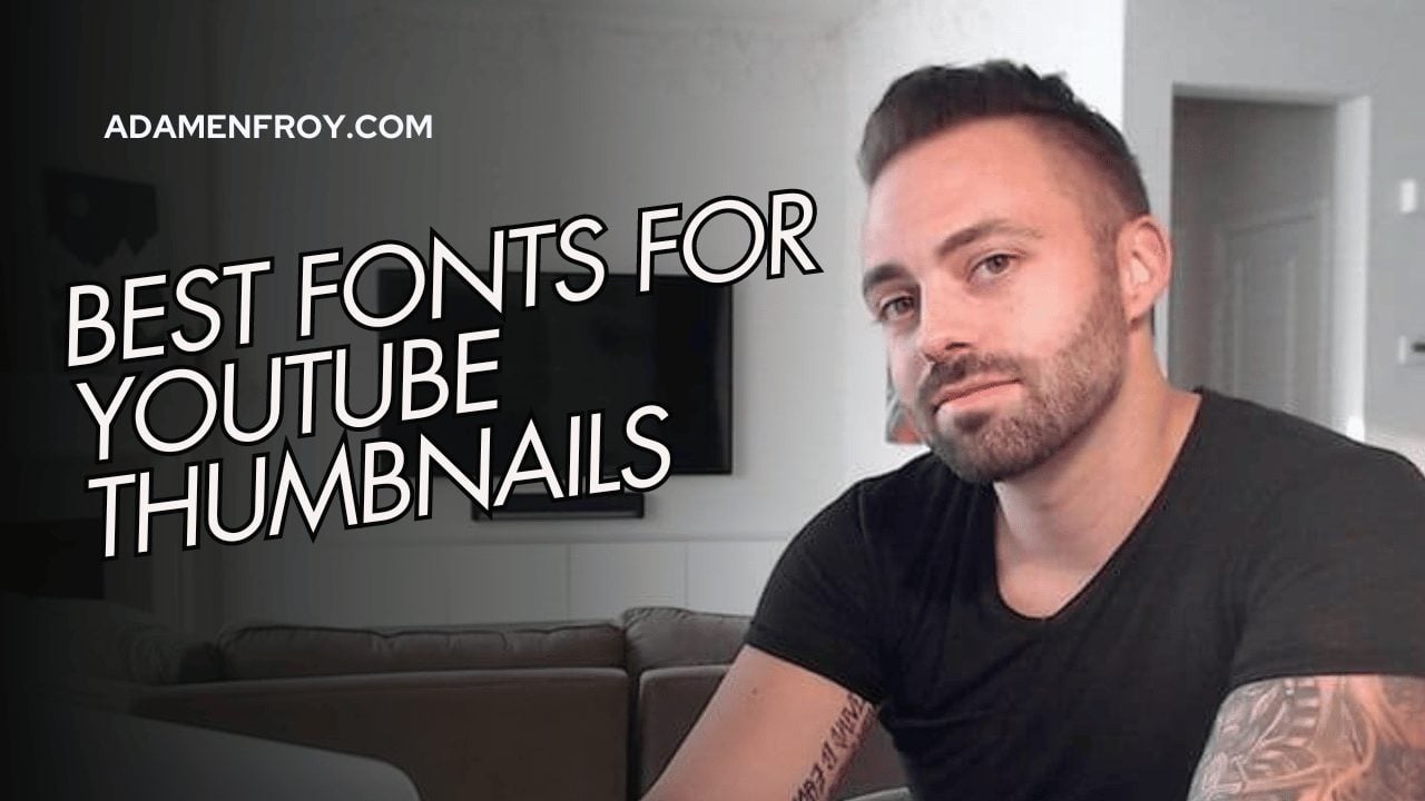

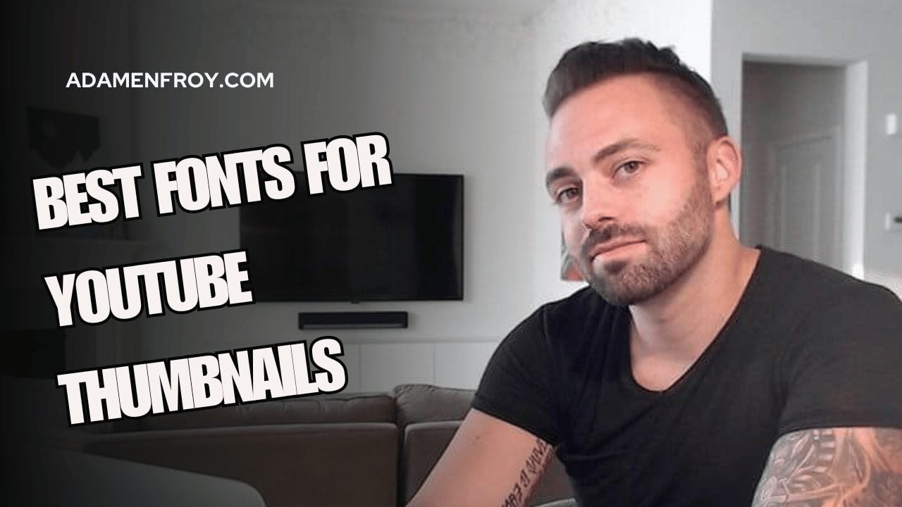
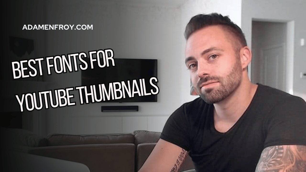
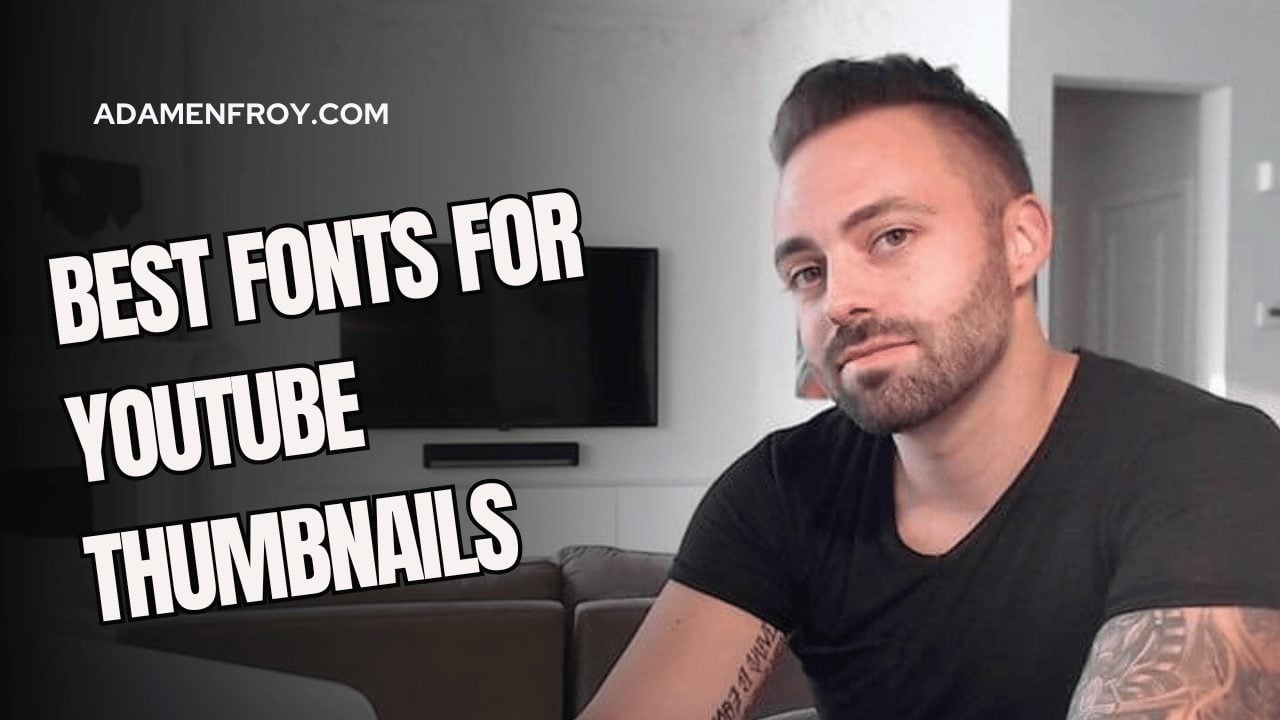
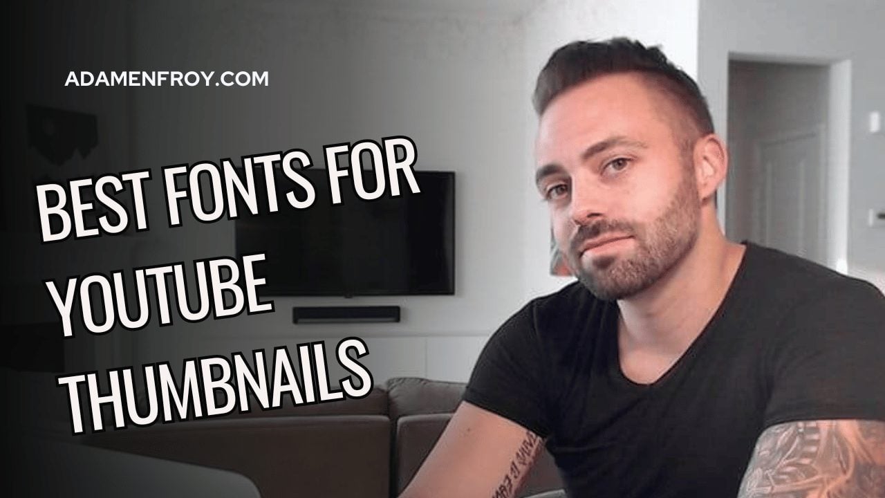
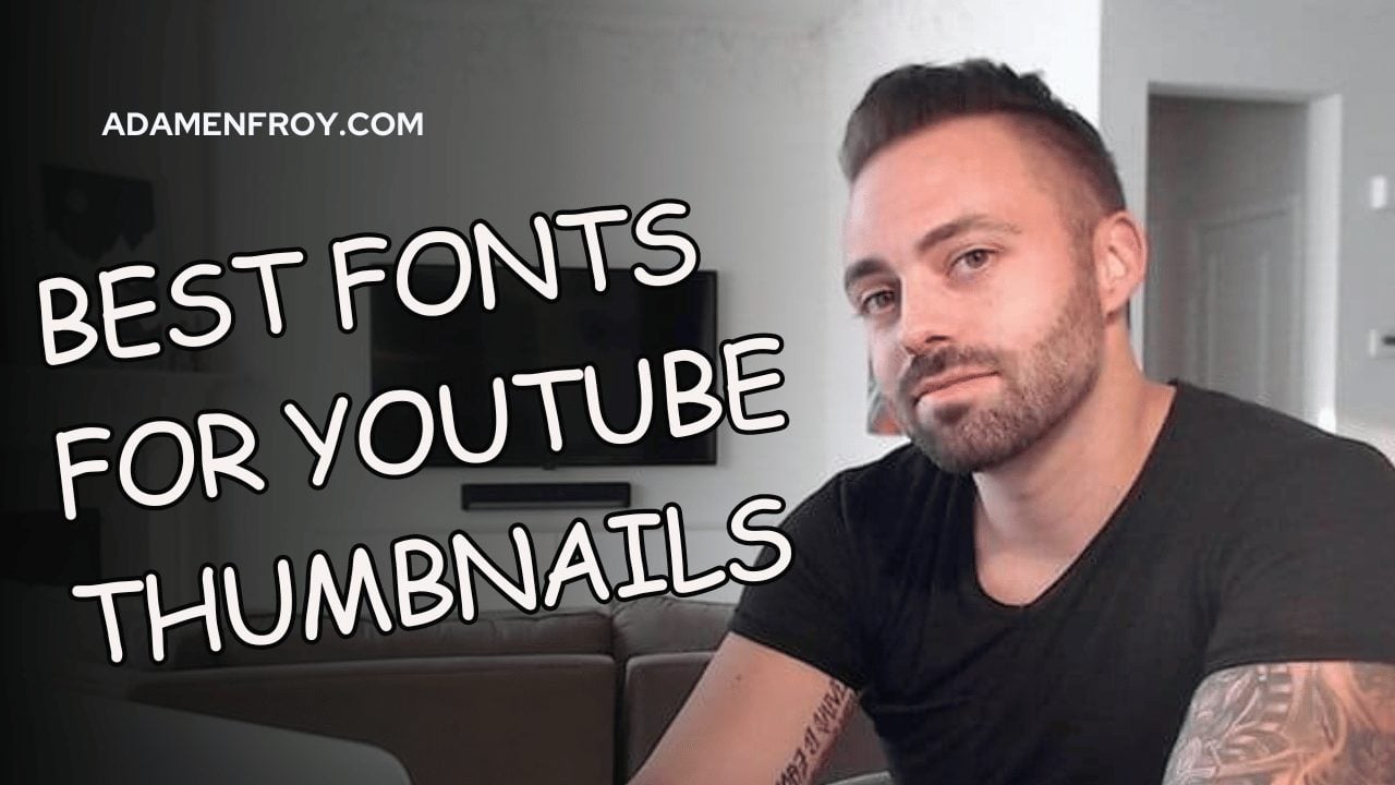
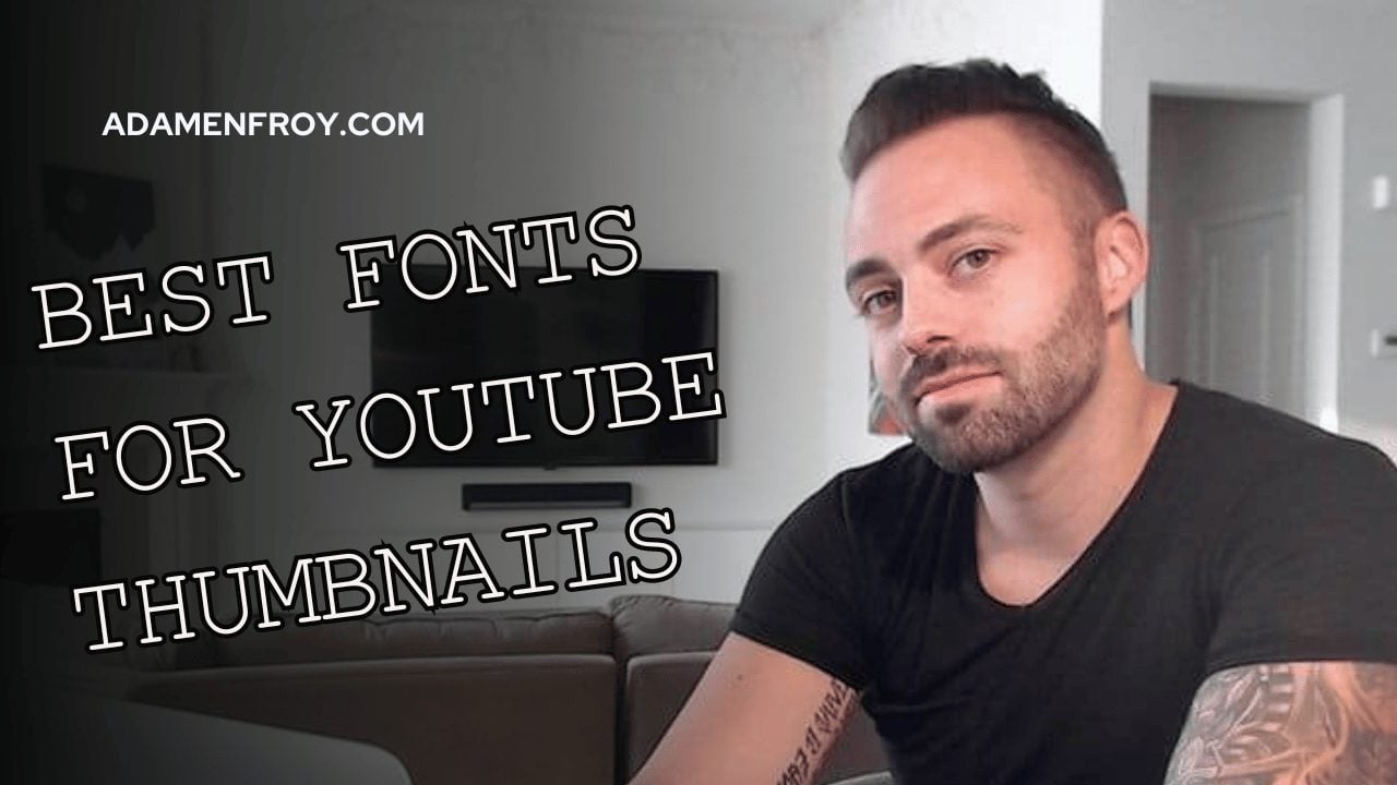
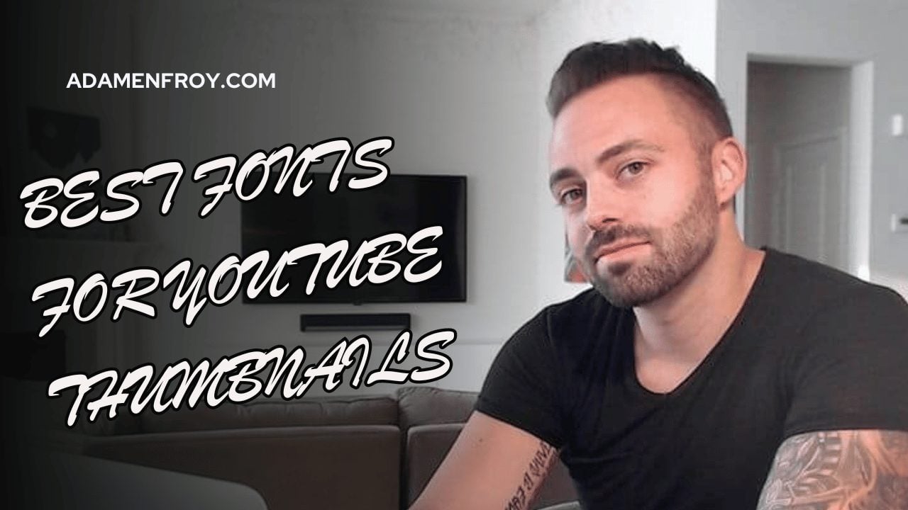
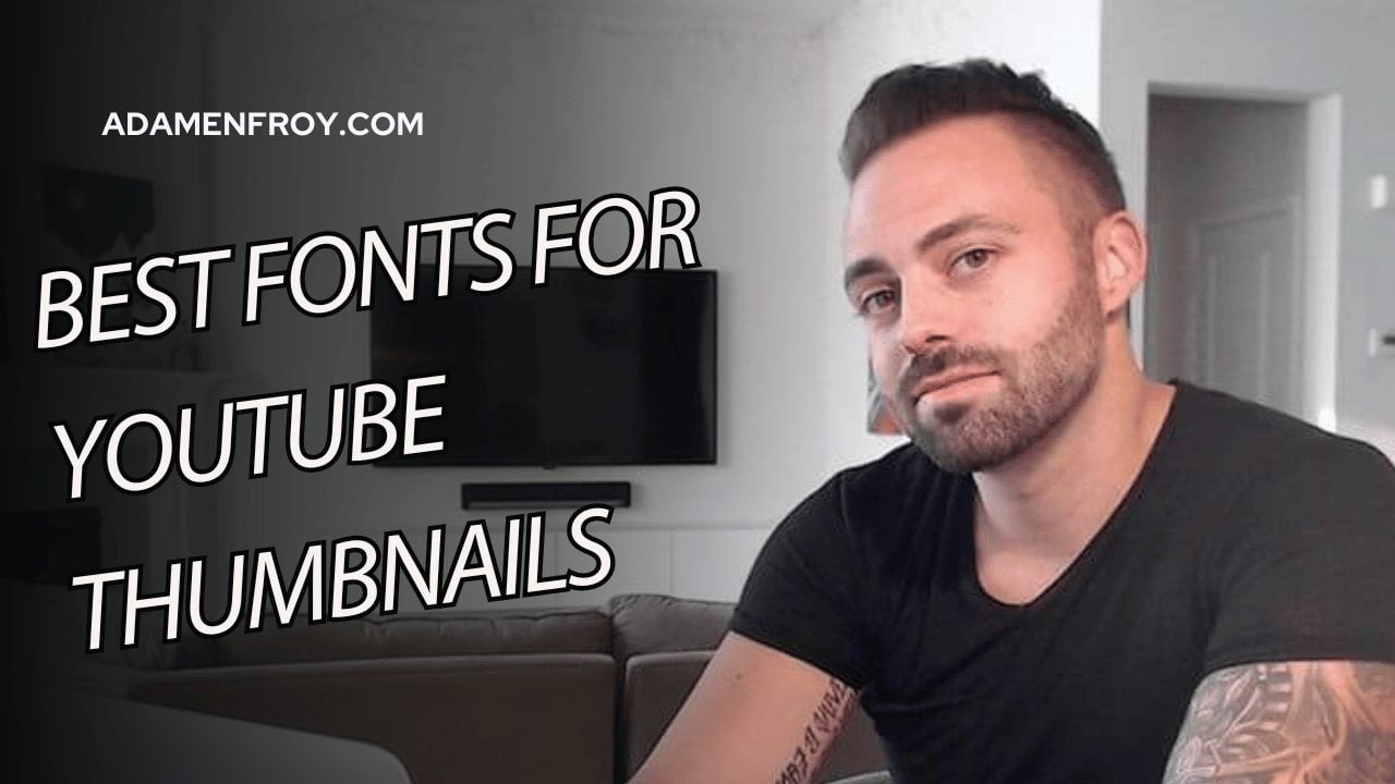
Thumbnails can make or break your YouTube success.
And a big part of thumbnail success comes down to the font.
Think you can just pick any font for your thumbnails? Wrong.
The right font could:
- increase your click-through rate
- boost viewer engagement
- strengthen your brand identity
- and make your content more memorable.
I have a YouTube channel with over 200,000 subscribers, so I know what works.
Trust me, the fonts you choose can help you stand out and get more clicks.
And in this post, I’ll share the best fonts for YouTube thumbnails this year. Let’s get started!
What Is The Best Font For YouTube Thumbnails?
I’ve categorized the font list below into the most popular families.
I’ve also included an image with the specific font to show what each font looks like.
Serif Fonts
Georgia

Looking for a font that conveys professionalism and trust?
Georgia is a great fit.
It’s clear, legible, and looks good even in small sizes.
If your channel focuses on serious topics like news or education, this font will give your thumbnails a polished, credible vibe.
Garamond

Garamond is a classic, refined font that maintains excellent readability.
It brings a touch of elegance, making it a great choice for a wide range of channels—from DIY tutorials to lifestyle vlogs.
This font strikes a balance between looking authoritative and approachable.
Playfair Display

Want your thumbnails to pop?
Playfair Display is a modern serif font with high contrast between thick and thin strokes, perfect for bold statements.
It’s effective for channels covering fashion, art, or luxury topics.
Overall, it adds a touch of drama to your designs.
Merriweather

If you need to pack a lot of text into a small space without compromising legibility, Merriweather is a strong contender.
Designed for screen readability, it’s ideal for channels with complex or lengthy titles.
Think tech reviews or deep-dive analysis videos.
Times New Roman

It may be basic, but Times New Roman has its advantages.
Its familiarity makes it instantly recognizable.
If simplicity is your goal, this font keeps the focus on your message rather than flashy design.
Sans-Serif Fonts
Roboto

Roboto is a standout choice for those seeking clarity.
This clean, neutral font works well across all screen sizes.
It keeps your text crisp and easy to read, no matter how complex your thumbnail design.
Lato

For a balance between professional and friendly, Lato delivers.
Its rounded edges and harmonious proportions make it perfect for YouTube thumbnails in lifestyle, travel, or self-improvement niches.
It also adds a welcoming touch to thumbnails without sacrificing polish.
Montserrat

Need a bold, attention-grabbing headline?
Montserrat’s geometric structure helps your text stand out.
It’s great for design, architecture, or art-focused channels.
Its clean lines ensure your thumbnails look sharp and modern.
Raleway

For a sleek, sophisticated look, Raleway is your go-to.
It’s versatile enough for creating a distinct visual hierarchy in your thumbnails.
The result?
It guides the viewer’s eye to the most important details.
Poppins

Poppins brings a friendly, rounded feel.
This font is great for educational or community-focused content.
I would describe it as approachable yet versatile.
It also provides enough weight options to create dynamic, multi-layered thumbnail designs.
Futura

Looking for a timeless, authoritative font?
Futura’s geometric shapes are great for science, tech, or future-oriented channels.
Its clean, bold structure suggests high-quality, forward-thinking content.
Helvetica

Helvetica is a tried-and-true font if you want your thumbnails to be clear and straightforward.
Its neutrality keeps the focus on your content, making it ideal for news or documentary-style videos.
Script Fonts
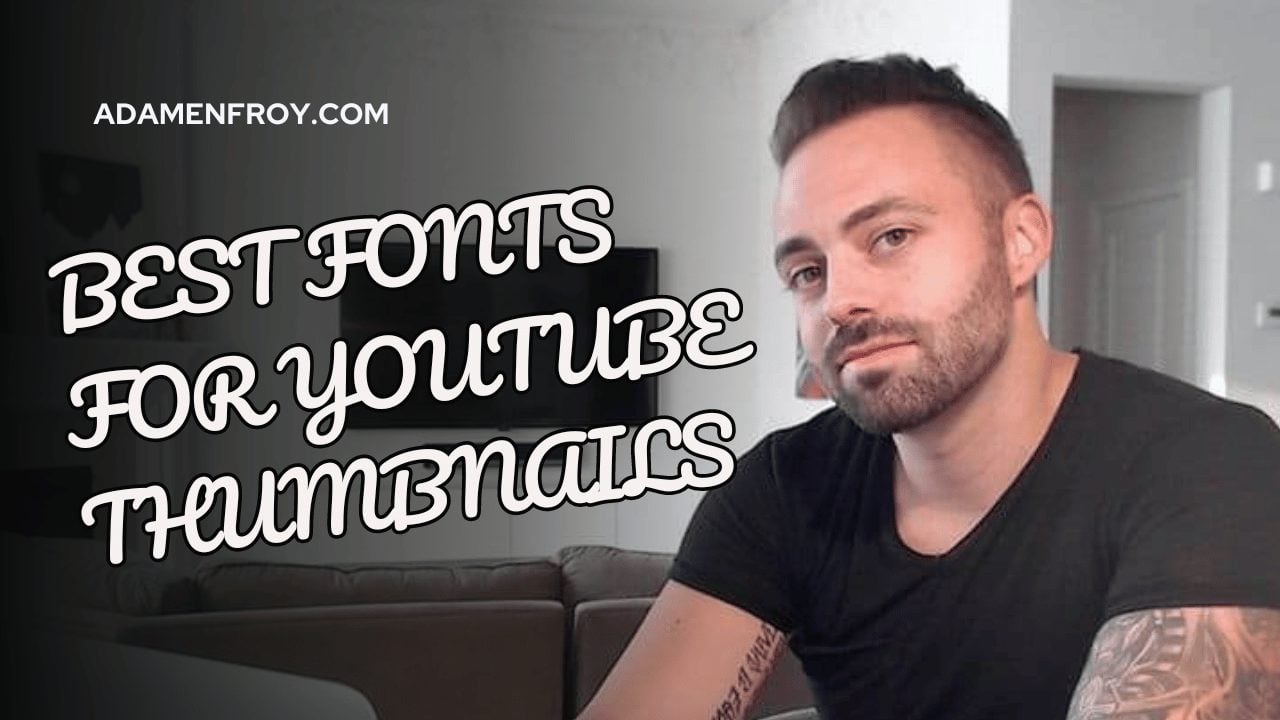
Pacifico

If your goal is to connect with your audience on a personal level, Pacifico’s handwritten style can help.
It’s ideal for lifestyle vlogs and creative tutorials.
This font also works when publishing content where authenticity and warmth are key.
Use it sparingly, as it can be overwhelming if overdone.
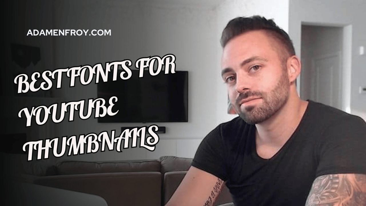
Lobster

Need to make a big splash?
Lobster’s bold strokes bring energy and excitement to your thumbnails.
Its eye-catching design can help your videos stand out in crowded search results.
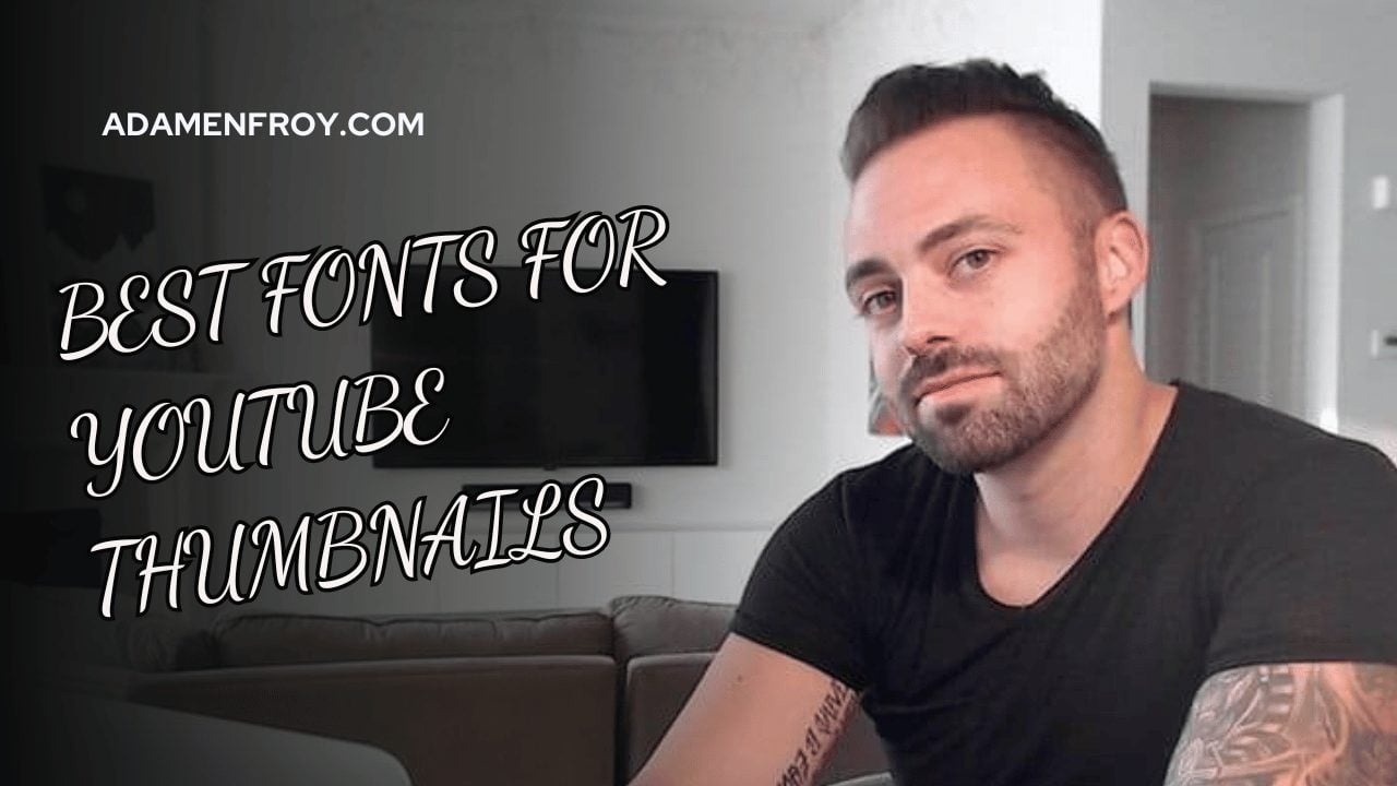
Dancing Script

Publishing content with a creative or elegant vibe?
Dancing Script adds a fluid, sophisticated touch.
It’s perfect for channels focused on arts, crafts, or cooking.
Using this font helps your thumbnails feel more refined and polished.
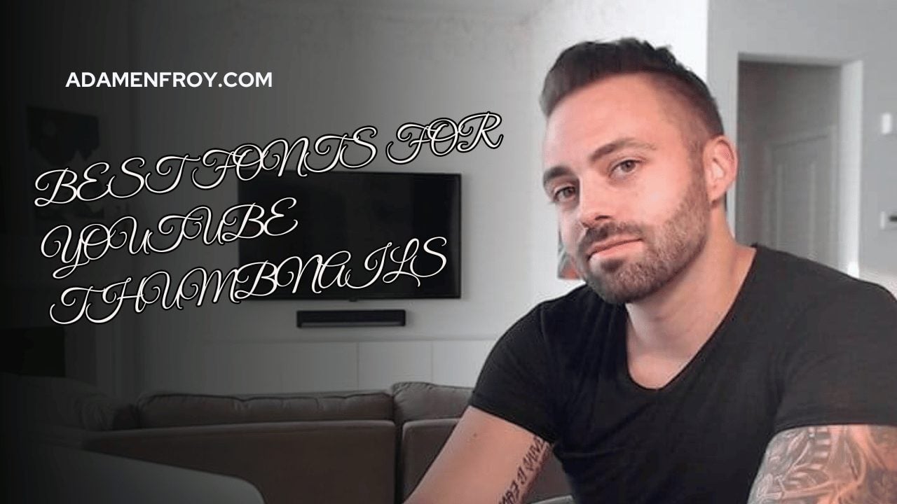
Great Vibes

If nostalgia or vintage charm suits your content, Great Vibes brings that retro feel.
It’s a great option for historical content or romantic themes.
Just be cautious with its readability at smaller sizes.
Display Fonts
Impact

For bold, in-your-face headlines, Impact is a go-to.
Its thick, condensed structure ensures your text remains visible – even in small thumbnails.
It’s especially useful for high-energy content where you want to communicate urgency.
Bebas Neue

Bebas Neue is a sleek and modern font.
Its narrow characters help fit longer titles without crowding the design.
This creates a clean, dynamic look.
Anton

Anton’s bold, condensed form is perfect when you need to convey excitement or action.
Some niches that might work well with this font include fitness, gaming, or DIY content.
Here, a punchy, energetic vibe is key and this matches Anton’s style well.
Oswald

Oswald blends classic and modern styles.
It’s also compact and sophisticated, ensuring your thumbnails remain readable and stylish.
Additional Fonts
Comic Sans MS

While Comic Sans MS often gets a bad rap, it works well for playful, kid-friendly, or humorous content.
It’s lighthearted and informal.
If your channel aims to entertain or educate younger audiences, it’s worth considering.
Courier New

For a retro, typewriter-like feel, Courier New is a perfect fit.
It’s a great choice for channels focusing on tech history, coding, or anything with a vintage theme.
When you use it, it gives your thumbnails a distinct, technical look.
Brush Script MT

Need a handcrafted, intimate vibe?
Brush Script MT adds warmth and a personal touch.
It’s perfect for creative or lifestyle channels where a closer connection with the audience is desired.
Myriad

For a clean, modern, and highly versatile font, Myriad works well.
It’s professional without being too stiff, making it a great option for tech reviews, business, or lifestyle content.
Choosing the Best Font for YouTube Thumbnails
Still on the fence with what’s the right font for you?
Here’s a breakdown of the key factors to help you make the best decision.
Channel Branding
Your font needs to align with your channel’s overall branding.
Here’s what to think about:
- Logo Consistency: If your logo features a specific font, try to match or complement it in your thumbnails. A consistent look between your logo and thumbnails helps build brand recognition. For example, if you have a sleek, modern logo, pair it with a clean sans-serif font for your thumbnails. On the flip side, if your logo has a more classic serif font, keep that vibe in your thumbnails.
- Visual Harmony: Does the font fit your channel’s aesthetic? A tech channel might lean toward minimalistic, sleek fonts, while a lifestyle or cooking channel might benefit from warm and organic fonts. The goal is to create a cohesive look that ties your branding together.
Target Audience
Think about who’s watching your videos.
The right font can change depending on your audience:
- Age and Demographics: Younger audiences tend to be drawn to bold, playful fonts, while older viewers may prefer more traditional, elegant fonts. If you’re creating content for gamers, you might go for something more edgy or futuristic. A travel channel might choose fonts that feel more adventurous or laid-back.
- Viewer Preferences: Also, get to know your audience. What are they into? A fitness channel’s audience might appreciate a clean, sharp font that feels active, while an art channel might need something more expressive. Tailoring your fonts to their tastes makes your thumbnails more engaging.
Message and Content
The mood and tone of your content should influence your font choice, too.
Here’s why:
- Content Mood: Think about how your font reflects your video’s mood. Fun, quirky fonts are perfect if your videos are playful or humorous. For more serious or professional content, stick to clean and straightforward fonts.
- Appropriate Messaging: Your font should match the vibe of your message. Professional content works well with simple, clear fonts like Roboto. Creative content allows you to go for more decorative options like Pacifico. The goal is to use a font that strengthens the overall message of your thumbnail.
Conclusion
I encourage content creators to experiment with different font combinations.
Pair these options and create unique, eye-catching thumbnails that effectively communicate their video’s content.
Like anything in marketing, it’s all about testing.
Finally, remember that the perfect font:
- aligns with your branding
- appeals to your target audience and
- effectively conveys your message.
With the right font choices, your thumbnails will stand out in the crowded YouTube platform.
And that is a must-do when you’re looking to get people’s attention.
Further reading on AdamEnfroy.com: If you’re looking to elevate your YouTube game beyond thumbnails, check out how to make YouTube thumbnails with AI.
For those just starting out, my guide on starting a YouTube channel will help you get set up for success.
Need more inspiration?
You might want to explore these YouTube banner design ideas to complement your thumbnails or dive into the best YouTube SEO tools to help your content get noticed.
And when it’s time to polish your videos, read my guide on editing YouTube videos for pro tips.
